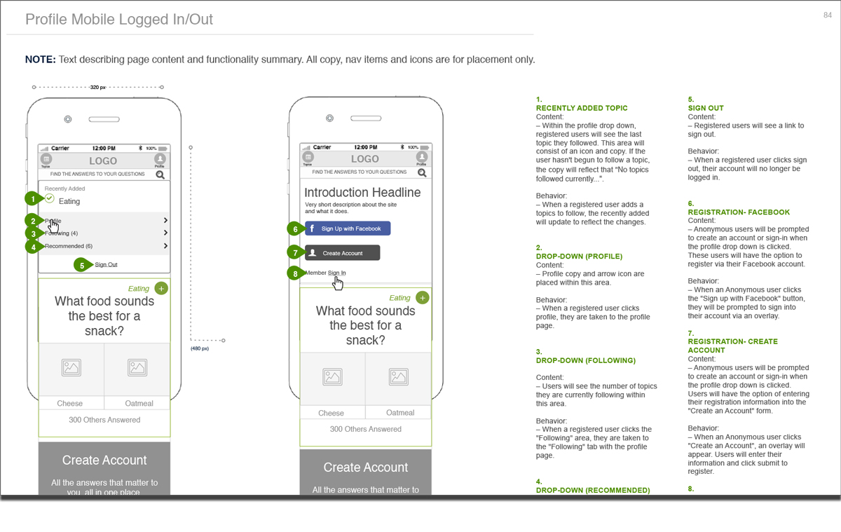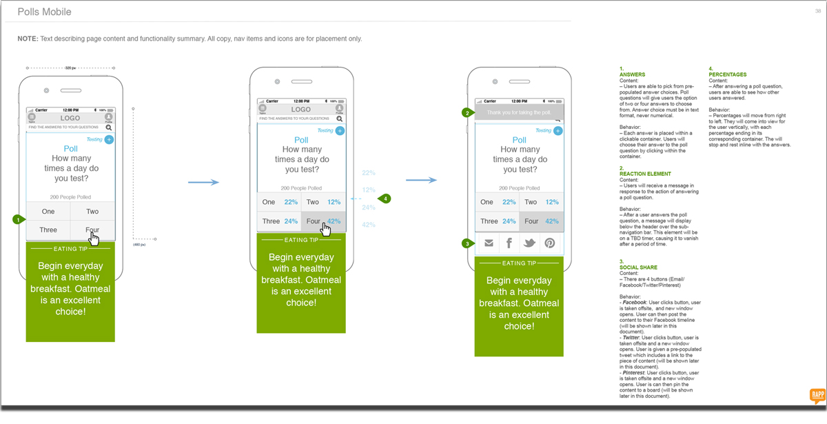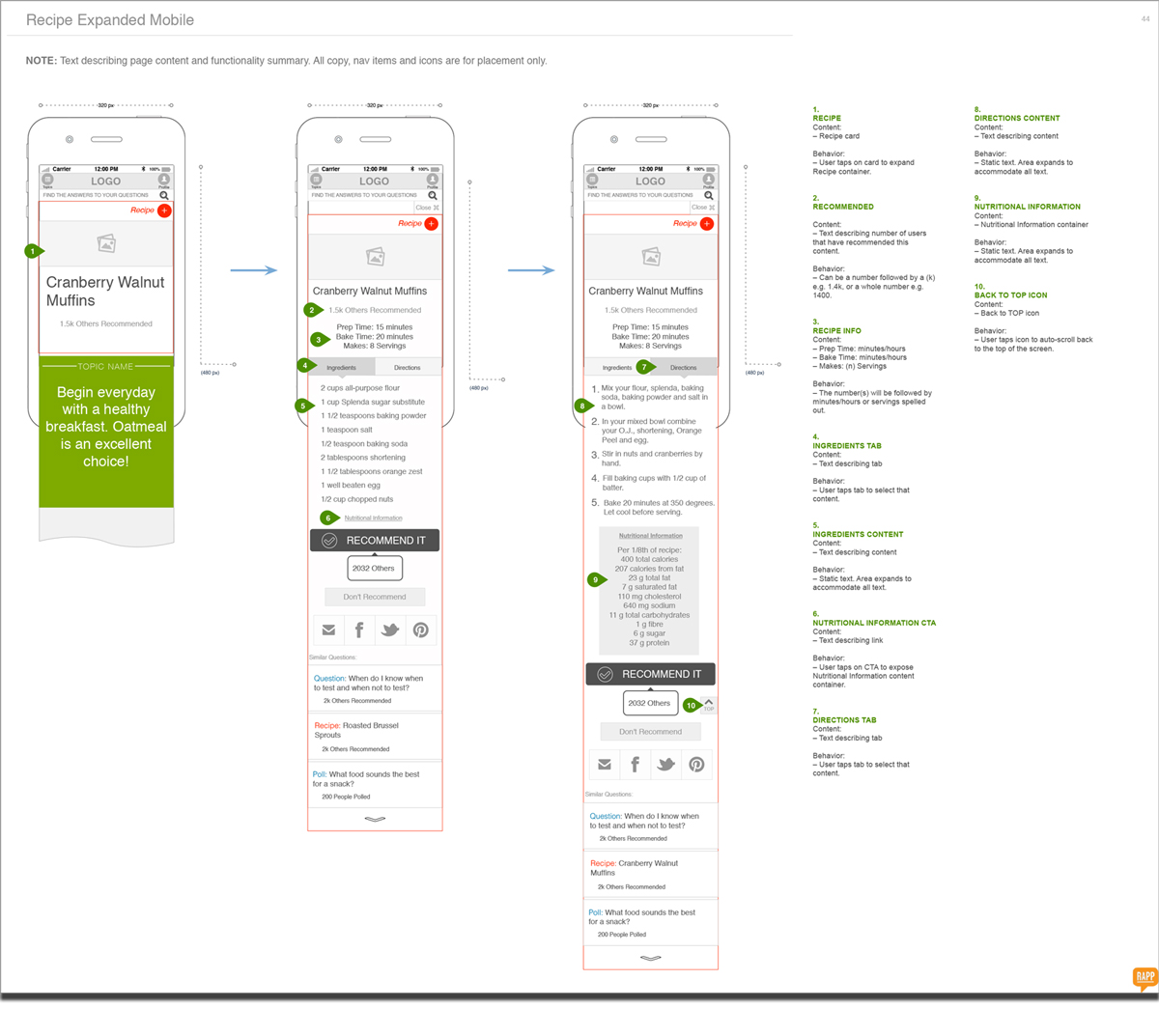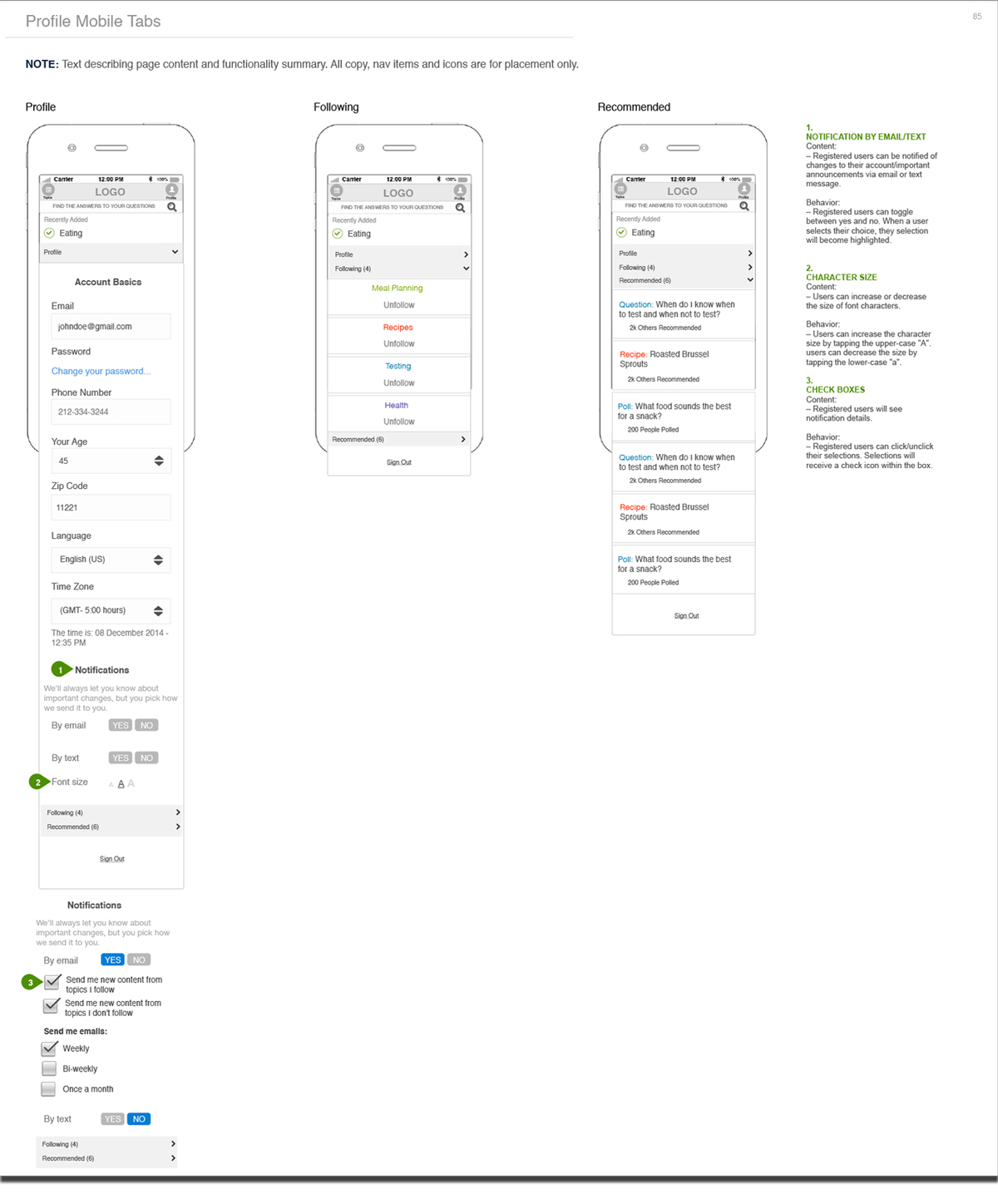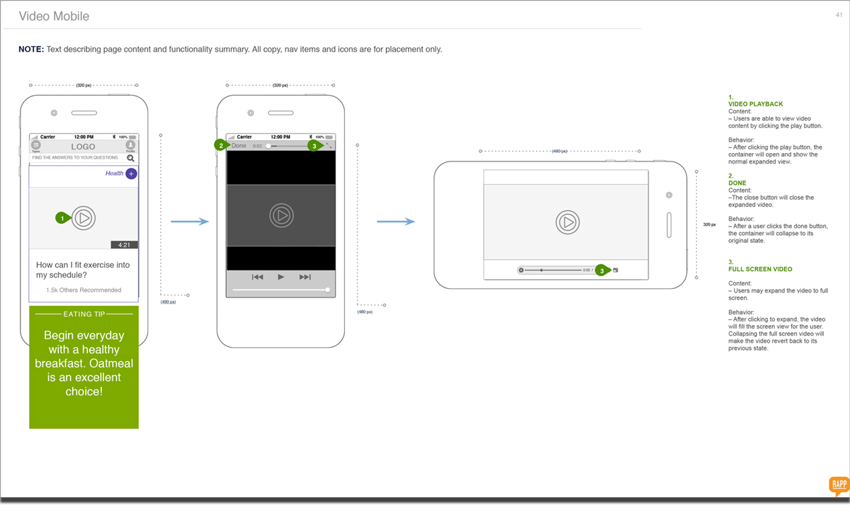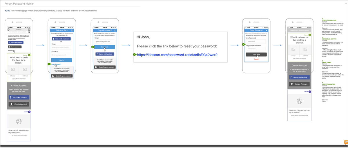
As a “Mobile First” designer my goal is always to create experiences that will be optimized for handheld devices. Sometimes that means building responsive or adaptive desktop designs knowing that they will modify at predetermined breakpoints to accommodate specific display devices. Other times that means designing “.m” sites that are mobile versions of desktop sites. And finally sometimes that means designing “native” device sites specifically for IOS and Android.
Although these differing types of mobile design all have their own intrinsic constraints the concept is always the same; users will ultimately experience this content in a mobile manner and “on-the-go”. This defines both the visual experience and often the timeframe in which experiences are engaged in.
EXAMPLES
Diabetes information support site design
